Impactful & Effective Black & White Web Designs
It’s no secret people are often drawn to black and white web designs. They’re often powerful, trendy and visually appealing. If you’re thinking about a website redesign for your business, you probably have designs in mind that you like, which may include the black and white color scheme. As a Des Moines website design company, we love collaborating with clients and hearing their goals and inspiration for their sites. Our designers are also trained in color theory to ensure the end result is a website strategically designed for each client.
The perceived simplicity of a black and white website design is misleading. Effectively using two colors to create visual appeal is harder than it looks. Whether or not your business is up for the challenge should be based on the purpose of your website. Each color conveys different emotions and evokes a different response from your users. You want to be sure your design is right for your business goals. When considering if a black and white website design is best for your business, the purpose of your website is the most critical factor to keep in mind. Black websites and sites with a white background each have their advantages depending on your goals.
Black Background Websites
Our Des Moines web design team is mindful of color psychology when creating a responsive web design. The color black is perceived as a strong, powerful color. Black websites can also convey professionalism, elegance and authority.
Web designers should be careful when creating black background websites because too much text on a black background can quickly get overwhelming. When using a dark web design, it’s best to include more visual elements and keep your content to a minimum. The text on a black background website should be used sparingly because it’s much harder for our eyes to read white text on a black website than black text on a white background.
Websites With White Backgrounds
On the color spectrum, white is known as a combination of all colors. Color psychology theories suggest it represents positivity, peace and simplicity, and encourages creativity. White backgrounds and products are often used to symbolize they are fresh, clean and simple. Apple always capitalizes on using white backgrounds and designs to advertise their newest creative products to reinforce color psychology theories and demonstrate their gadgets are innovative, simple and high tech.
For websites that have a lot of content, and especially a lot of words, it’s best to choose a white background for a clean and easy-to-read look.
Examples of The Best Black And White Website Designs
Even though the colors are limited, there are many creative ways to design unique black and white websites. Below we’ve included some of our favorite black and white website inspirations. These examples have a few things in common:
- They take advantage of the stark contrast and give balance to your website.
- Using black and white photos gives sites a classic look.
- They add a pop of color to the black and white websites to make callout buttons and important text stand out.
- Black websites bring in some gray tones for a bit less contrast.
Black and White Website Design: Studio Bjork

This responsive website design company uses the diagonal black and white design to hint at the direction you’ll be traveling on the page. Instead of scrolling vertically, Studio Bjork highlights their clients and their design work as you scroll to the right. The black background of the website works well since the focus is on the interactive experience instead of written content.
Black and White Website Design: Duft & Co.

This is a simple black and white landing page that lets you choose which side of this business you’re interested in. On Duft & Co. you can browse their treats on their Bakehouse site, or you can look at the menu for their Brickhouse restaurant. The clean layout serves its purpose by getting customers to the correct website while also clearly indicating this company specializes in two types of foods.
Black and White Website Design: Studio Grafite
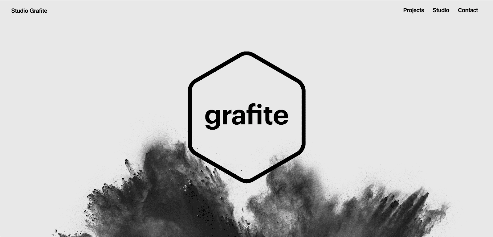
The black and white website designers at Studio Grafite did a great job choosing a look that ties back to their brand perfectly. “Grafite” is a play on words, similar to “graphite,” which is a form of coal. From a branding perspective, the dark gray, black and white design with the burst of coal dust at the bottom of the first fold makes sense.
Black and White Website Design: The Ordinary
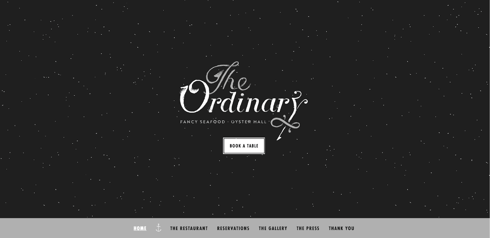
This website’s black and white design is anything but ordinary! The black background is elegant and makes you think of a romantic, star-filled night, which would be the perfect time to eat at this gourmet seafood restaurant. The touches of gray along with the anchor and hook icons tie back to the nautical theme, since The Ordinary primarily serves seafood.
Black and White Website Design: The Black Sheep Agency
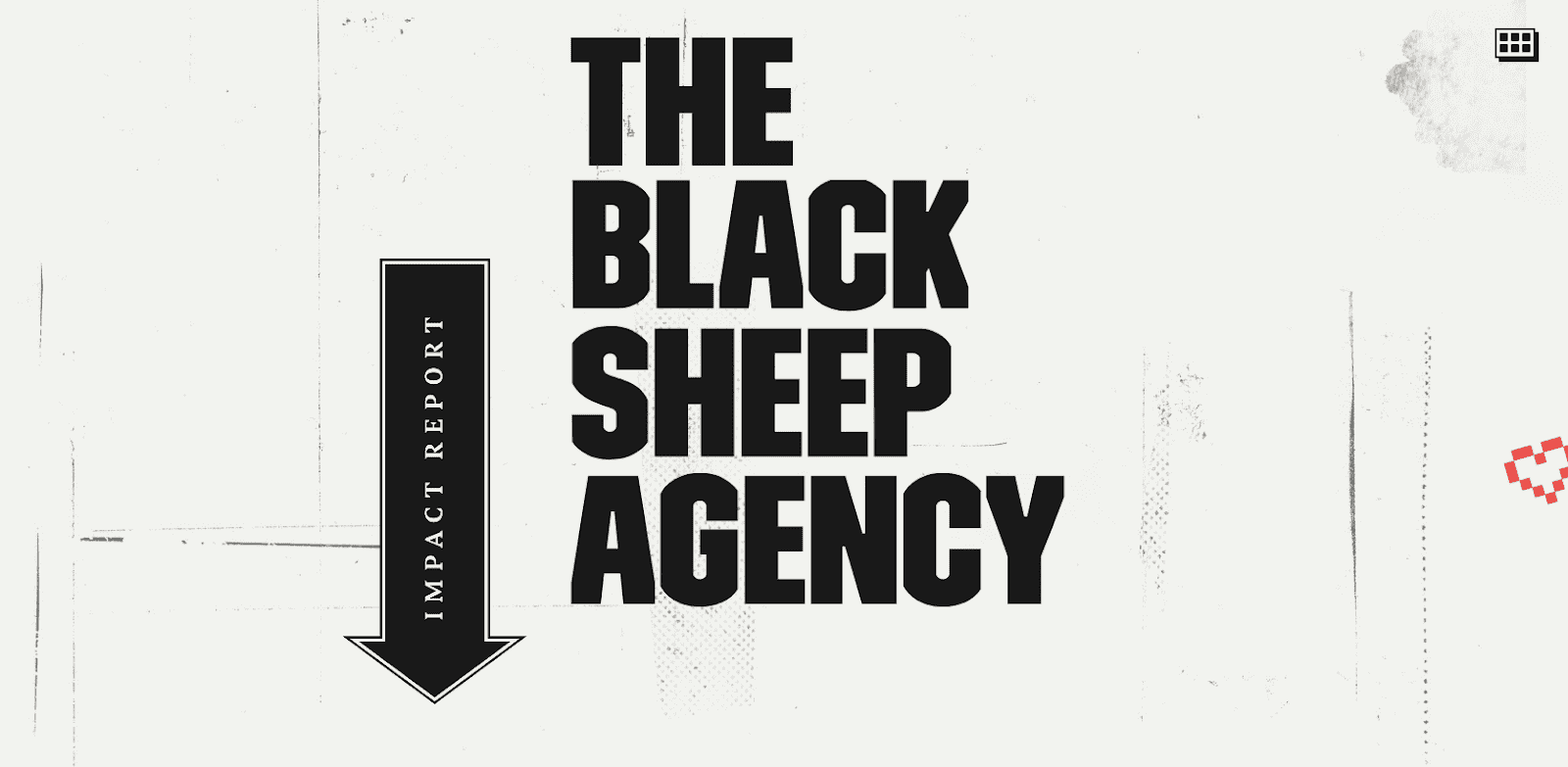
The Black Sheep Agency is focused on encouraging change and making a statement, and we believe their bold black and white website does just that. They stay true to black and white designs throughout the entire site while adding bursts of color to highlight their different causes. We also love the scroll animation effects that pop up as you explore their website.
Black and White Website Design: Double Barrel
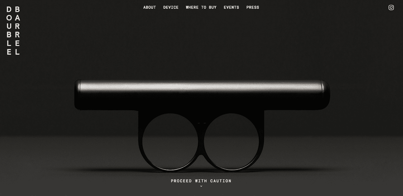
This black background website is an excellent fit for this powerful product. The Double Barrel device claims to be the perfect vaporizing experience with two barrels of oil instead of one. This black website offers an added sense of power to this sleek product.
Black and White Website Design: Made By Sofa

Although Facebook purchased the Sofa team in 2011, they still use their website to explain the acquisition to their customers and users of their previous software and apps. The simple black and white website is straightforward and serves its purpose in communicating Safa’s move to their clients.
Black and White Website Design: Melanie DaVeid
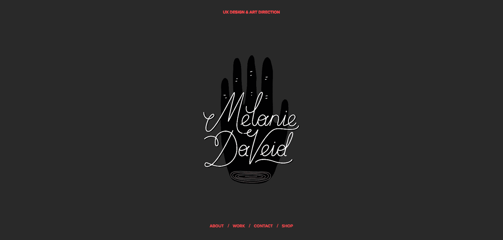
This black background website is actually a portfolio used by a talented UX designer. Melanie DaVeid created a responsive web design full of contrast and used color to separate and highlight her work.
Black and White Website Design: Gipimotor

The people who service Ferraris and other classic cars needed a website that’s polished and grabs your attention. By using a black and white photo of a beautiful car, Gipimotorradiates sophistication and class. The design also has a black background overlay to give it more power and authority.
Black and White Website Design: Salt & Pepper Agency

With a name like Salt & Pepper, it’s no wonder this responsive website development company chose a black and white website for themselves. They specialize in technical support and custom website functionality to help clients around the world launch development projects.
Black and White Website Design: Stonelime
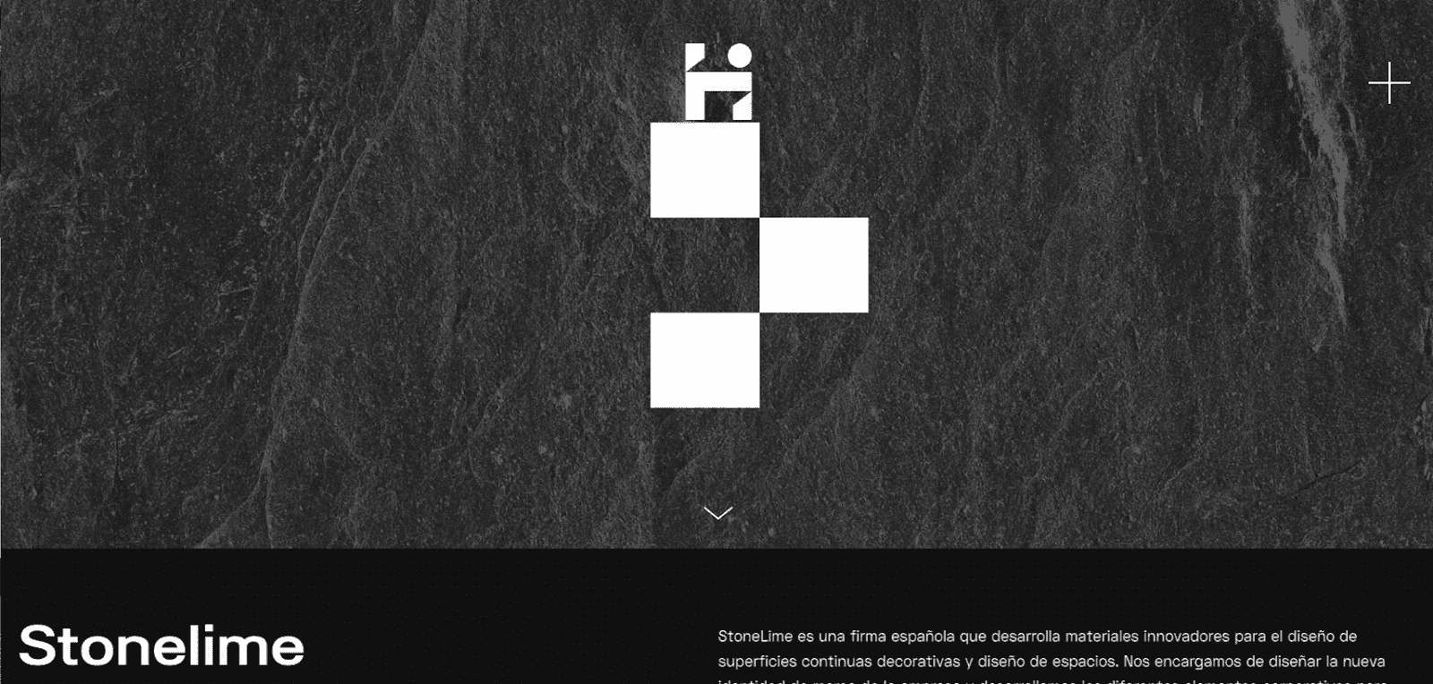
This black and white website design was done for Stonelime, a Spanish company that uses innovative materials to decorate spaces. The designers at Homeland Studio did a beautiful job using different shades of gray in the background to imitate the design materials that Stonelime uses.
Black and White Website Design: Airnauts

The experts at Airnauts combine design and technology elements to create responsive websites and apps. Their black background website is the perfect fit to grab the user’s attention right away and convey power and professionalism. They also use some diagonals throughout the web design, drawing users down the page.
Black and White Website Design: Dumbo Design

Although this is not technically a black and white website, it has similar characteristics that we like. This dark background website keeps text to a minimum and uses pink words and color accents to highlight relevant information as you scroll.
